Best Esthetician & Aesthetics Websites: 9 Inspiring Examples
Discover the best esthetician website examples to inspire your own. Learn how to increase online bookings & build an online portfolio clients will notice.
Discover the best esthetician website examples to inspire your own. Learn how to increase online bookings & build an online portfolio clients will notice.

Key Takeaways
- An esthetician website is an effective way to showcase your portfolio, services, pricing, and reviews
- Websites for service-based businesses in the beauty, wellness, and health industry can also function as a booking hub, allowing clients to put themselves on your schedule without calling or emailing back and forth
- Every GlossGenius plan comes with a free custom booking website where you can book clients, upload photos, and list your service menu, all starting at $24/month
Why Do Estheticians Need a Website?
Creating a dedicated website to showcase your work is one of the quickest ways to attract new clients and retain the ones you’ve got. If you’ve gone through the rigors of esthetician training, you’re undoubtedly ready to show the world how talented you are and start building a loyal clientele. But what if you don’t have big bucks to shell out on a web designer?
The good news is that building esthetician websites is easier than ever with technology like GlossGenius’ website builder and app. As your go-to salon software provider, we’re here to support you on your professional esthetician career path, and that includes building an online presence.
Try GlossGenius free for 14 days!
How Much Does it Cost to Build an Esthetician Website?
The total cost of building your esthetician website depends on where it’s hosted, the website builder, and how much content you’ll need on it — such as photos, videos, or dynamic content. This could cost even more if you want to add retail sale features, or if you’ll need the help of a website designer. Basic, low maintenance sites may only cost a few dollars a month, but more advanced features can cost $100–$200 or more.
In addition to management features for your appointment-based esthetician business, GlossGenius includes a custom website builder with every plan. Here, we break down GlossGenius’s three pricing plans:
Top 9 Best Esthetician Websites and Examples
Here are the picks for the best esthetician websites, including some incredible websites built with GlossGenius:
1. Miss Esthetics
- Website built with: GlossGenius
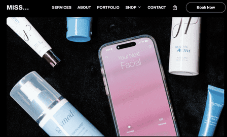
Built with GlossGenius, Miss Esthetics features a dark theme and a clear menu with bold print, beautiful typography, and a Book Now button. Scroll down a bit, and you see a new-client special, followed by other featured services. You can also click over to the Services page for a complete rundown of all services. The Portfolio page shows real results and the expected timeframe – for instance, two microneedling sessions to see results.
One of our favorite parts of this site is the client testimonials section on its homepage. Five-star reviews from real clients are a great way to demonstrate social proof and build confidence in your services.
2. Aesthetics Montecito
- Website built with: Wordpress
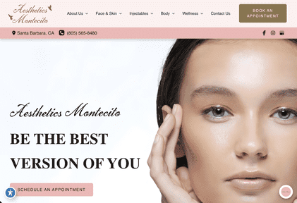
We love the flawless skin, featured treatments, and descriptive copy on Aesthetics Montecito’s homepage. The social links take you to the business’s Facebook and Instagram pages, where you can view additional information and photos.
Their top menu reveals several options, including services, contact information, and an About page detailing the clinic’s professionals and history. Plus, the menu stays visible no matter where you navigate on the website. Responsive website design also makes it easy to view the site on mobile devices. An upgrade to the Aesthetics Montecito website would be appointment scheduling features, as the site currently only offers the option to call or email the clinic.
3. Stephanie Schuh Beauty
- Website built with: Showit
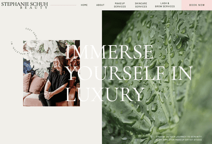
Top-level navigation and a conspicuous Book Now button make Stephanie Schuh Beauty a winning esthetician website in our book. The menu isn’t overkill, either – just a few basic pages are all this site needs to get visitors from browsing to booking in a few clicks. We also like that Stephanie dedicated some homepage real estate to telling visitors more about herself and her background, instilling confidence and trust.
Scroll a bit farther on the homepage, and you’ll see everything you need to make a booking decision. Stephanie includes her services, pricing, and a portfolio gallery all on the same page – great for mobile visitors who would rather not click around the site.
4. Skin Pretty
- Website built with: GlossGenius
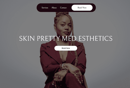
Beautiful typography, simple navigation, and prominently featured specials are what make Skin Pretty shine. The site, another GlossGenius creation, is clean yet effective in conveying the services and pricing, with a Book Now button that makes it easy to schedule an appointment.
The inclusion of reviews on the site allows visitors to get a feel for this esthetician’s services, while a contact page enables seamless communication. This is an excellent example of how to create a no-frills website with powerful capabilities behind the scenes, including payment processing and appointment scheduling.
5. SKINBYGABBY
- Website built with: Squarespace
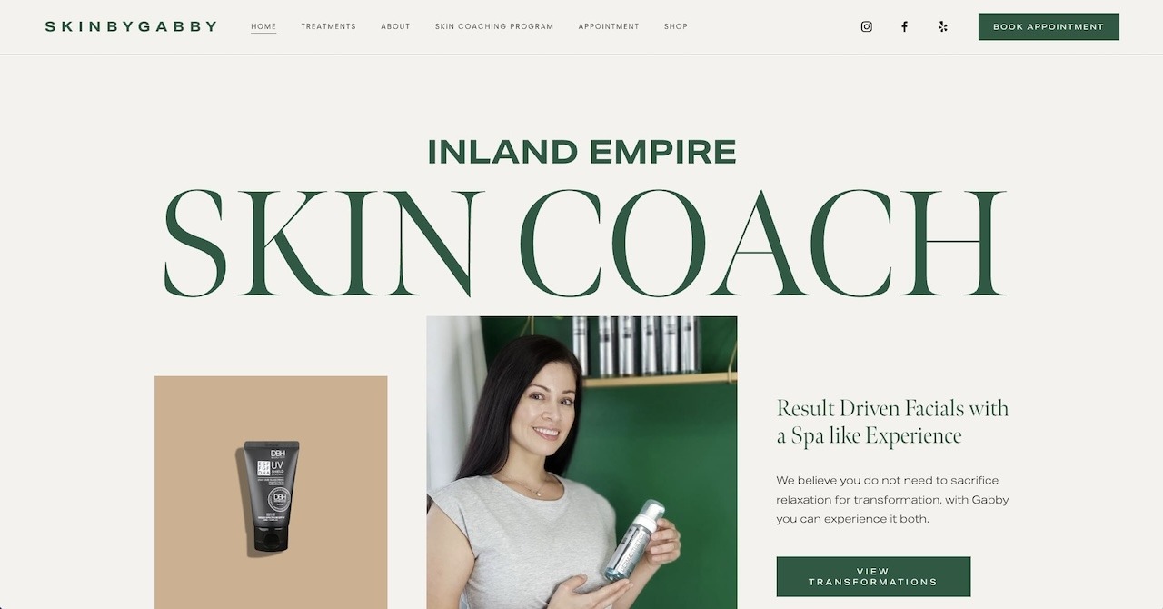
One look at the SKINBYGABBY site, and you’ll instantly feel compelled to explore what “The Skin Coach” has to offer, if not book an appointment on the spot. Bold lettering, soothing green and beige colors, and the reassurance that Gabby provides a spa-like experience entice users to learn more.
Top-level navigation has the basics, like a Services page and a booking link. But, it also includes extras like links to social media and Yelp, a shopping page, and a Skin Coaching Program for those who need additional one-on-one support. Gabby even offers esthetician coaching, making her the ultimate go-to expert for all things skin and beauty products. Professional, informative, and visually beautiful, the SKINBYGABBY spa website is everything an esthetician website should be.
6. The Face Space
- Website built with: Squarespace
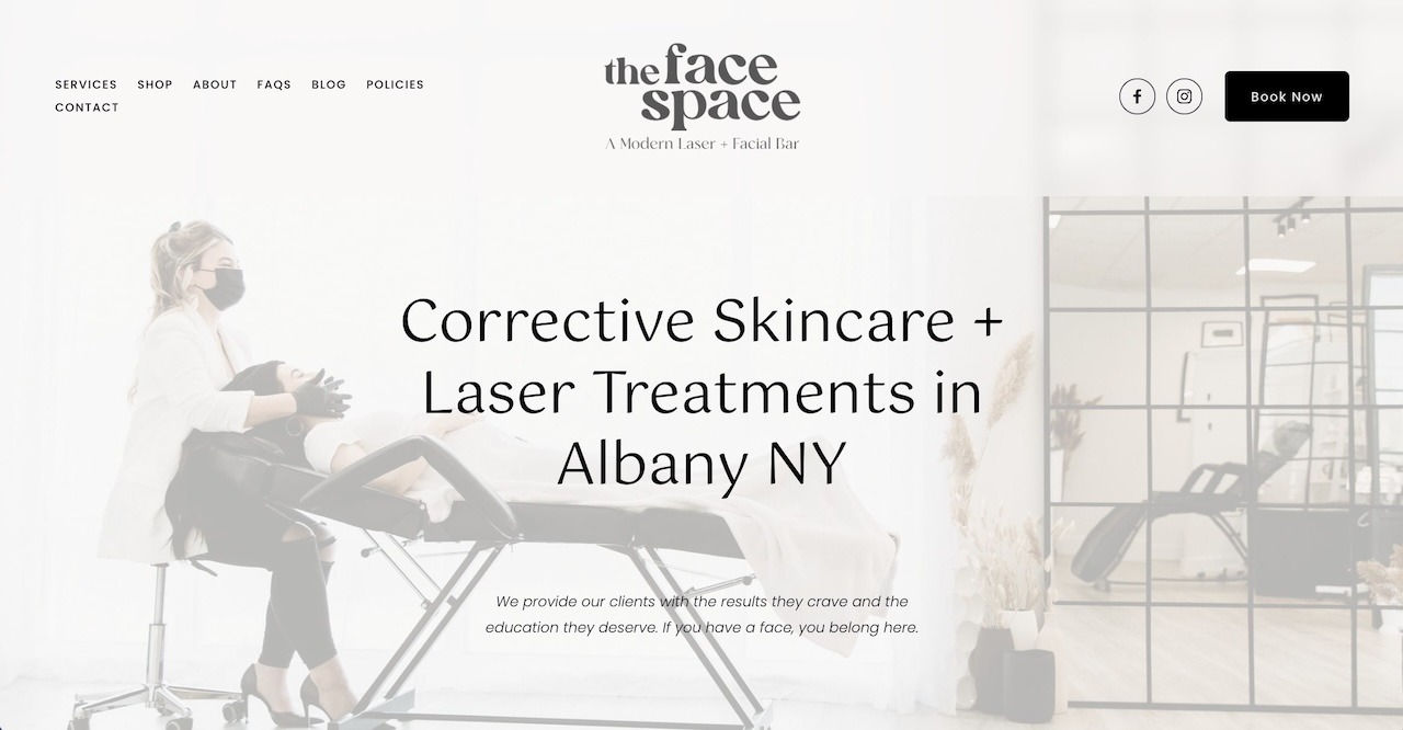
The Face Space is a modern laser and facial bar offering various laser, skincare, and cosmetic services in a bright, welcoming space with a team of skin care professionals. Born during the pandemic, The Face Space has a beautiful website with intuitive navigation and compelling copy that invites visitors to “fall in love” with their skin again.
The homepage utilizes negative space to highlight its services, reviews, and owner, while a Book Now button is easy to find at the top and bottom of every page. One notable differentiator of The Face Space’s site is a blog. While sparse, the blog is a good reminder that you can build your online presence and demonstrate your expertise in numerous ways. They also offer a page to purchase gift cards.
[CTA_MODULE]
7. Jodi Mello Esthetician
- Website built with: Squarespace
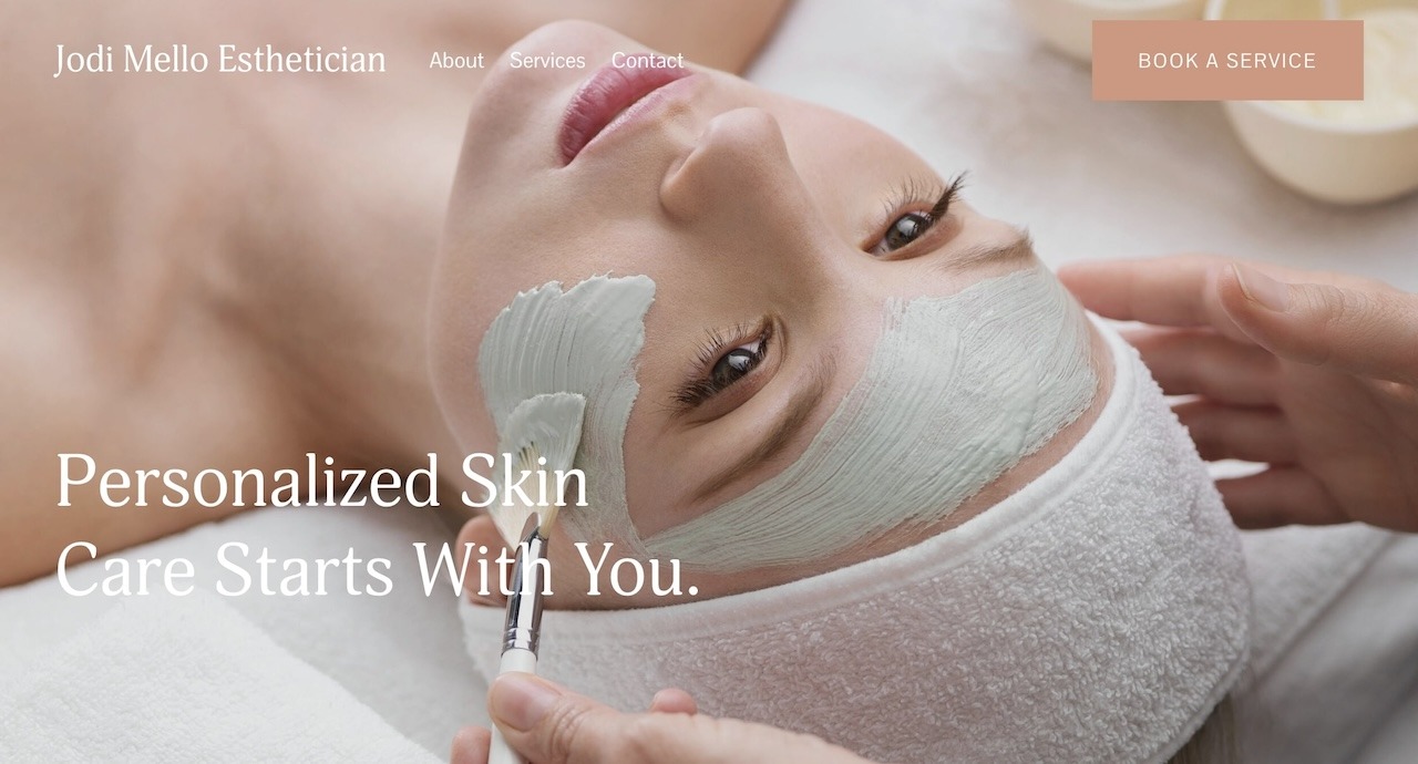
It doesn’t get much simpler than About, Services, and Contact in terms of menu simplicity, and that’s where Jodi Mello Esthetician’s website shines. A large photo and headline remind visitors that “Personalized Skin Care Starts With You.” Jodi also includes a scheduling button at the top and bottom; click the link, and you’ll be taken to a contact page with her contact information and an invitation to call or text to book an appointment.
While the site doesn’t include online booking options, we appreciate that its services page clearly outlines the available offerings and costs, so there’s no question about pricing. The site is also aesthetically pleasing, with a soft color scheme and gorgeous fonts – just as you would expect from someone specializing in visual appearances.
8. Rose + Honey Skincare Pacific Beach
- Website built with: Squarespace
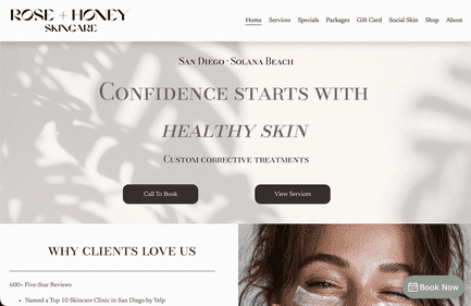
Visit the Rose + Honey Skincare website, and you’ll immediately notice glimpses of inclusivity. It’s a place where freckles are celebrated and there’s a solution for every skincare concern, from acne to skin texture. A tidy list of services keeps content organized, so users can learn more about the services that interest them.
Contact information, location, and hours are all accessible from the homepage – perfect for busy browsers on the go. Meanwhile, ever-present top-level navigation includes pages for Services, Specials, Gift Cards, Reviews, and more. This site also has a blog under its Social Skin tab, so Rose + Honey fans have a place to find all the latest skincare products, news, and tips.
9. Esthetics by Klarissa
- Website built with: GlossGenius
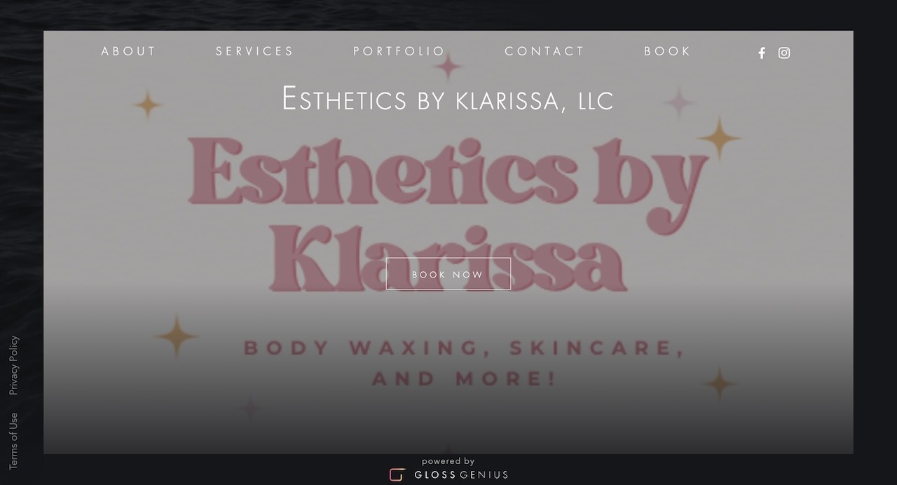
Another GlossGenius gem, Esthetics by Klarissa reminds you right away to schedule an appointment, with its Book Now button overlaid on the homepage. Of course, if you’d care to learn more before scheduling your service, you can click over to the About, Services, and Portfolio pages from the top-level navigation.
We love that you can book a “Silent Appointment” – because let’s face it, we’re not always in the mood for small talk. Other unique offerings include various bridal packages and services specifically for men. In addition to the Portfolio, the site contains links to its social media pages, so users can take a peek at before-and-afters before tapping the booking link.
What Makes a Good Esthetician Website?
Your clients might be all about looking and feeling beautiful, but your website needs more than a pretty face. Below are the essential elements that take esthetician websites from “meh” to “wow” and contribute to positive user experiences on your site.
Intuitive Navigation
Potential clients might find your website through search or your social pages. A user-friendly layout is essential for helping them find what they need quickly and preventing bounces – people who leave your site quickly without converting to the next step, like booking an appointment.
Simplicity is key to helping them find what they’re looking for – typically your services, pricing, location, hours, booking links, and expected results. If you have new-client specials or featured services, showcase them prominently above the fold on your homepage. Include a clear navigation bar with a booking link on every page, either at the top or prominently within the website copy.
Easy Appointment Booking
If your website is doing its job to attract potential clients and serve existing clientele, they’ll want to book appointments easily. Whether for initial consultations or licensed esthetician services like microneedling and facials, it’s essential to have a booking button that clients can click to select an appointment date and time. With GlossGenius, it’s easy to integrate appointment scheduling into your esthetician website and fill up your calendar.
Mobile Responsiveness
Did you know that 63% of searches happen on mobile devices in the United States? Also, Google now prioritizes mobile-first indexing, meaning the search giant favors mobile versions of a website over desktop when crawling and indexing pages.
The bottom line? Having a mobile-responsiveness website is imperative for getting ranked and attracting local traffic. It also contributes to a great user experience when your website is viewable on any device, forms are easily fillable, and appointment booking is seamless even on small screens. When you build your esthetician website with GlossGenius, you can also create a mobile app for your business, making mobile responsiveness a non-issue.
High-Quality Photos
What services do you offer that lend themselves to before-and-after photography? From acne facials to skin correction, ensure your website shows off the results of your services. If you work from a salon, include photos of the treatment room so potential clients can get a feel for the space. With a thoughtful online gallery of your work, anyone visiting your website with specific skin concerns will know what to expect – and book an appointment!
[CTA_MODULE]
GlossGenius: More Than Just a Website Builder
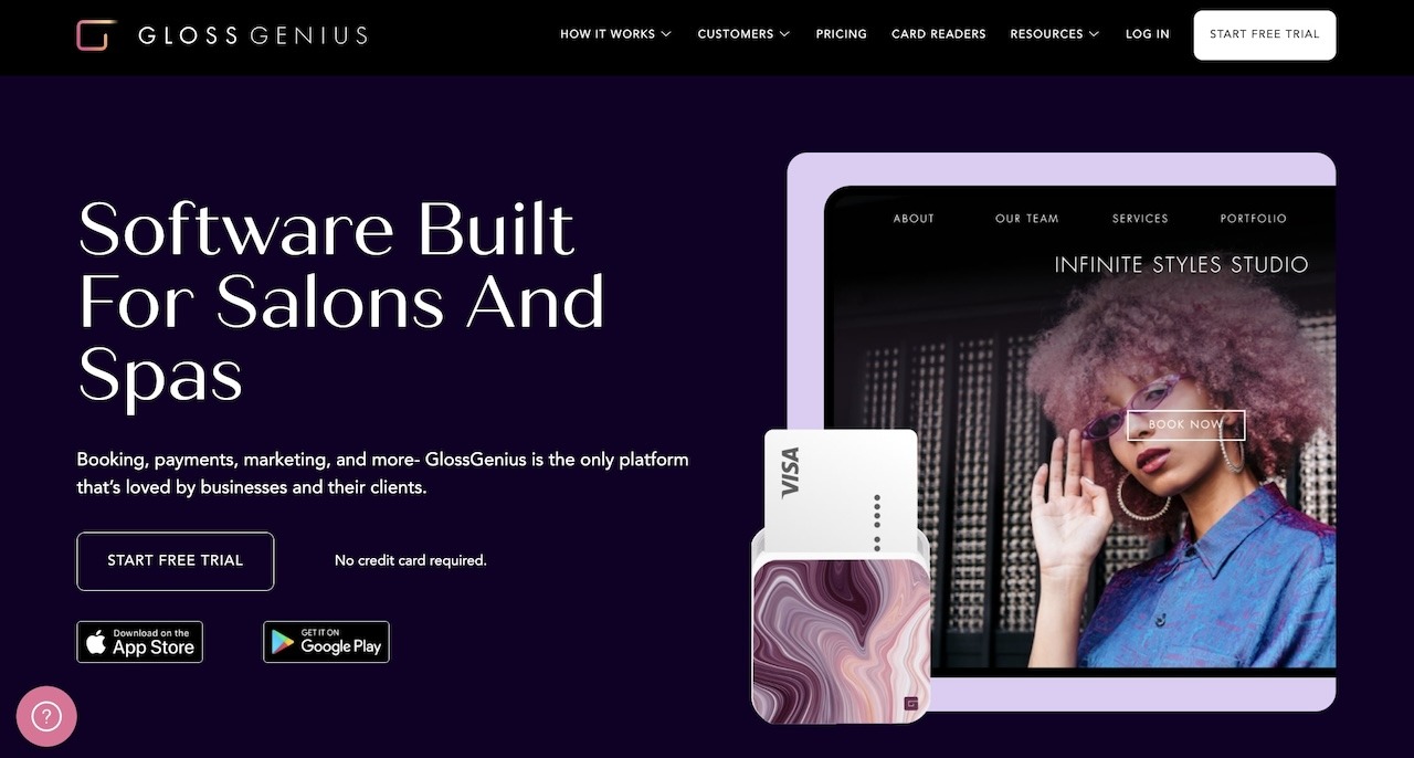
Building a website is an excellent start when you’re building an esthetician business and trying to increase bookings. And for many estheticians, GlossGenius is the easiest, fastest way to get up and running without all the heavy lifting. Yet we offer so much more than website building for estheticians.
From appointment booking and payments to managing finances, taxes, team members, and more, GlossGenius is an all-in-one platform to run every aspect of your business without any extra work, software, or fees. With GlossGenius, you’re in control of your business from day one, and we grow with you as your business evolves.
GlossGenius also provides essential features for medspas and estheticians, such as Photo Management and Markup features. These tools make it easy to not only upload and sort client photos, but mark treatment zones and create a visual plan.
And with GlossGenius Charting, you can create a chart for each client visit with all of your documentation — including SOAP notes. Ensure your clients’ privacy with HIPAA-compliant EMR that comes with MD signoff to keep things professional and secure.
Whether you’re a newly certified esthetician or a seasoned pro ready to ramp up your digital presence, GlossGenius has a solution to meet your needs. To learn more and get started, start a free trial today and begin building the website your esthetician business deserves.
Frequently Asked Questions
Are there free esthetician website builders?
Yes. Associated Skin Care Professionals (ASCP) members can access a free website builder with a valid membership. However, the membership itself is not free and costs around $259/month for practicing professionals who need insurance.
How to start a website for an esthetician?
If you’re an esthetician looking to build a website, the first step is to find the right website builder for your needs. Choose one that not only fits your budget, but provides the functionality you’ll require to advertise your services and information. Make sure the builder allows photos, videos, or other dynamic content if you’re looking to showcase your portfolio or services in action. Another bonus is if the website lets you integrate a ‘Book Now’ button for seamless scheduling.
Does GlossGenius offer a website builder for estheticians?
Yes! All GlossGenius members can access a custom website builder that displays information about them and their business, booking and social media integrations, a service menu with pricing, photos, testimonials, contact forms, and more. If you’re looking for more than just a booking website for your aesthetics business, GlossGenius plans start at $24/month.
.png)
.png)
Join Our Genius Newsletter
Get the latest articles, inspiring how-to’s, and educational workbooks delivered to your inbox.
Best Esthetician & Aesthetics Websites: 9 Inspiring Examples
Discover the best esthetician website examples to inspire your own. Learn how to increase online bookings & build an online portfolio clients will notice.


Key Takeaways
- An esthetician website is an effective way to showcase your portfolio, services, pricing, and reviews
- Websites for service-based businesses in the beauty, wellness, and health industry can also function as a booking hub, allowing clients to put themselves on your schedule without calling or emailing back and forth
- Every GlossGenius plan comes with a free custom booking website where you can book clients, upload photos, and list your service menu, all starting at $24/month
Why Do Estheticians Need a Website?
Creating a dedicated website to showcase your work is one of the quickest ways to attract new clients and retain the ones you’ve got. If you’ve gone through the rigors of esthetician training, you’re undoubtedly ready to show the world how talented you are and start building a loyal clientele. But what if you don’t have big bucks to shell out on a web designer?
The good news is that building esthetician websites is easier than ever with technology like GlossGenius’ website builder and app. As your go-to salon software provider, we’re here to support you on your professional esthetician career path, and that includes building an online presence.
Try GlossGenius free for 14 days!
How Much Does it Cost to Build an Esthetician Website?
The total cost of building your esthetician website depends on where it’s hosted, the website builder, and how much content you’ll need on it — such as photos, videos, or dynamic content. This could cost even more if you want to add retail sale features, or if you’ll need the help of a website designer. Basic, low maintenance sites may only cost a few dollars a month, but more advanced features can cost $100–$200 or more.
In addition to management features for your appointment-based esthetician business, GlossGenius includes a custom website builder with every plan. Here, we break down GlossGenius’s three pricing plans:
Top 9 Best Esthetician Websites and Examples
Here are the picks for the best esthetician websites, including some incredible websites built with GlossGenius:
1. Miss Esthetics

- Website built with: GlossGenius
Built with GlossGenius, Miss Esthetics features a dark theme and a clear menu with bold print, beautiful typography, and a Book Now button. Scroll down a bit, and you see a new-client special, followed by other featured services. You can also click over to the Services page for a complete rundown of all services. The Portfolio page shows real results and the expected timeframe – for instance, two microneedling sessions to see results.
One of our favorite parts of this site is the client testimonials section on its homepage. Five-star reviews from real clients are a great way to demonstrate social proof and build confidence in your services.
2. Aesthetics Montecito

- Website built with: Wordpress
We love the flawless skin, featured treatments, and descriptive copy on Aesthetics Montecito’s homepage. The social links take you to the business’s Facebook and Instagram pages, where you can view additional information and photos.
Their top menu reveals several options, including services, contact information, and an About page detailing the clinic’s professionals and history. Plus, the menu stays visible no matter where you navigate on the website. Responsive website design also makes it easy to view the site on mobile devices. An upgrade to the Aesthetics Montecito website would be appointment scheduling features, as the site currently only offers the option to call or email the clinic.
3. Stephanie Schuh Beauty

- Website built with: Showit
Top-level navigation and a conspicuous Book Now button make Stephanie Schuh Beauty a winning esthetician website in our book. The menu isn’t overkill, either – just a few basic pages are all this site needs to get visitors from browsing to booking in a few clicks. We also like that Stephanie dedicated some homepage real estate to telling visitors more about herself and her background, instilling confidence and trust.
Scroll a bit farther on the homepage, and you’ll see everything you need to make a booking decision. Stephanie includes her services, pricing, and a portfolio gallery all on the same page – great for mobile visitors who would rather not click around the site.
4. Skin Pretty

- Website built with: GlossGenius
Beautiful typography, simple navigation, and prominently featured specials are what make Skin Pretty shine. The site, another GlossGenius creation, is clean yet effective in conveying the services and pricing, with a Book Now button that makes it easy to schedule an appointment.
The inclusion of reviews on the site allows visitors to get a feel for this esthetician’s services, while a contact page enables seamless communication. This is an excellent example of how to create a no-frills website with powerful capabilities behind the scenes, including payment processing and appointment scheduling.
5. SKINBYGABBY

- Website built with: Squarespace
One look at the SKINBYGABBY site, and you’ll instantly feel compelled to explore what “The Skin Coach” has to offer, if not book an appointment on the spot. Bold lettering, soothing green and beige colors, and the reassurance that Gabby provides a spa-like experience entice users to learn more.
Top-level navigation has the basics, like a Services page and a booking link. But, it also includes extras like links to social media and Yelp, a shopping page, and a Skin Coaching Program for those who need additional one-on-one support. Gabby even offers esthetician coaching, making her the ultimate go-to expert for all things skin and beauty products. Professional, informative, and visually beautiful, the SKINBYGABBY spa website is everything an esthetician website should be.
6. The Face Space

- Website built with: Squarespace
The Face Space is a modern laser and facial bar offering various laser, skincare, and cosmetic services in a bright, welcoming space with a team of skin care professionals. Born during the pandemic, The Face Space has a beautiful website with intuitive navigation and compelling copy that invites visitors to “fall in love” with their skin again.
The homepage utilizes negative space to highlight its services, reviews, and owner, while a Book Now button is easy to find at the top and bottom of every page. One notable differentiator of The Face Space’s site is a blog. While sparse, the blog is a good reminder that you can build your online presence and demonstrate your expertise in numerous ways. They also offer a page to purchase gift cards.
[CTA_MODULE]
7. Jodi Mello Esthetician

- Website built with: Squarespace
It doesn’t get much simpler than About, Services, and Contact in terms of menu simplicity, and that’s where Jodi Mello Esthetician’s website shines. A large photo and headline remind visitors that “Personalized Skin Care Starts With You.” Jodi also includes a scheduling button at the top and bottom; click the link, and you’ll be taken to a contact page with her contact information and an invitation to call or text to book an appointment.
While the site doesn’t include online booking options, we appreciate that its services page clearly outlines the available offerings and costs, so there’s no question about pricing. The site is also aesthetically pleasing, with a soft color scheme and gorgeous fonts – just as you would expect from someone specializing in visual appearances.
8. Rose + Honey Skincare Pacific Beach

- Website built with: Squarespace
Visit the Rose + Honey Skincare website, and you’ll immediately notice glimpses of inclusivity. It’s a place where freckles are celebrated and there’s a solution for every skincare concern, from acne to skin texture. A tidy list of services keeps content organized, so users can learn more about the services that interest them.
Contact information, location, and hours are all accessible from the homepage – perfect for busy browsers on the go. Meanwhile, ever-present top-level navigation includes pages for Services, Specials, Gift Cards, Reviews, and more. This site also has a blog under its Social Skin tab, so Rose + Honey fans have a place to find all the latest skincare products, news, and tips.
9. Esthetics by Klarissa

- Website built with: GlossGenius
Another GlossGenius gem, Esthetics by Klarissa reminds you right away to schedule an appointment, with its Book Now button overlaid on the homepage. Of course, if you’d care to learn more before scheduling your service, you can click over to the About, Services, and Portfolio pages from the top-level navigation.
We love that you can book a “Silent Appointment” – because let’s face it, we’re not always in the mood for small talk. Other unique offerings include various bridal packages and services specifically for men. In addition to the Portfolio, the site contains links to its social media pages, so users can take a peek at before-and-afters before tapping the booking link.
What Makes a Good Esthetician Website?
Your clients might be all about looking and feeling beautiful, but your website needs more than a pretty face. Below are the essential elements that take esthetician websites from “meh” to “wow” and contribute to positive user experiences on your site.
Intuitive Navigation
Potential clients might find your website through search or your social pages. A user-friendly layout is essential for helping them find what they need quickly and preventing bounces – people who leave your site quickly without converting to the next step, like booking an appointment.
Simplicity is key to helping them find what they’re looking for – typically your services, pricing, location, hours, booking links, and expected results. If you have new-client specials or featured services, showcase them prominently above the fold on your homepage. Include a clear navigation bar with a booking link on every page, either at the top or prominently within the website copy.
Easy Appointment Booking
If your website is doing its job to attract potential clients and serve existing clientele, they’ll want to book appointments easily. Whether for initial consultations or licensed esthetician services like microneedling and facials, it’s essential to have a booking button that clients can click to select an appointment date and time. With GlossGenius, it’s easy to integrate appointment scheduling into your esthetician website and fill up your calendar.
Mobile Responsiveness
Did you know that 63% of searches happen on mobile devices in the United States? Also, Google now prioritizes mobile-first indexing, meaning the search giant favors mobile versions of a website over desktop when crawling and indexing pages.
The bottom line? Having a mobile-responsiveness website is imperative for getting ranked and attracting local traffic. It also contributes to a great user experience when your website is viewable on any device, forms are easily fillable, and appointment booking is seamless even on small screens. When you build your esthetician website with GlossGenius, you can also create a mobile app for your business, making mobile responsiveness a non-issue.
High-Quality Photos
What services do you offer that lend themselves to before-and-after photography? From acne facials to skin correction, ensure your website shows off the results of your services. If you work from a salon, include photos of the treatment room so potential clients can get a feel for the space. With a thoughtful online gallery of your work, anyone visiting your website with specific skin concerns will know what to expect – and book an appointment!
[CTA_MODULE]
GlossGenius: More Than Just a Website Builder

Building a website is an excellent start when you’re building an esthetician business and trying to increase bookings. And for many estheticians, GlossGenius is the easiest, fastest way to get up and running without all the heavy lifting. Yet we offer so much more than website building for estheticians.
From appointment booking and payments to managing finances, taxes, team members, and more, GlossGenius is an all-in-one platform to run every aspect of your business without any extra work, software, or fees. With GlossGenius, you’re in control of your business from day one, and we grow with you as your business evolves.
GlossGenius also provides essential features for medspas and estheticians, such as Photo Management and Markup features. These tools make it easy to not only upload and sort client photos, but mark treatment zones and create a visual plan.
And with GlossGenius Charting, you can create a chart for each client visit with all of your documentation — including SOAP notes. Ensure your clients’ privacy with HIPAA-compliant EMR that comes with MD signoff to keep things professional and secure.
Whether you’re a newly certified esthetician or a seasoned pro ready to ramp up your digital presence, GlossGenius has a solution to meet your needs. To learn more and get started, start a free trial today and begin building the website your esthetician business deserves.
Frequently Asked Questions
Are there free esthetician website builders?
Yes. Associated Skin Care Professionals (ASCP) members can access a free website builder with a valid membership. However, the membership itself is not free and costs around $259/month for practicing professionals who need insurance.
How to start a website for an esthetician?
If you’re an esthetician looking to build a website, the first step is to find the right website builder for your needs. Choose one that not only fits your budget, but provides the functionality you’ll require to advertise your services and information. Make sure the builder allows photos, videos, or other dynamic content if you’re looking to showcase your portfolio or services in action. Another bonus is if the website lets you integrate a ‘Book Now’ button for seamless scheduling.
Does GlossGenius offer a website builder for estheticians?
Yes! All GlossGenius members can access a custom website builder that displays information about them and their business, booking and social media integrations, a service menu with pricing, photos, testimonials, contact forms, and more. If you’re looking for more than just a booking website for your aesthetics business, GlossGenius plans start at $24/month.
Download Now
.png)
.png)
Join Our Genius Newsletter
Get the latest articles, inspiring how-to’s, and educational workbooks delivered to your inbox.


